font <- 'Arial Narrow'Week 4: SOC 223
Preparation
Set font to use:
Question 1:
Load the data.
nfl <- read_csv('https://github.com/NicolasRestrep/223_course/raw/main/Data/nfl_salaries.csv')Question 2:
nfl <-
  pivot_longer(
    nfl,
    cols = c(2:11),
    names_to = 'position',
    values_to = 'salary'
  )
Rows: 8,000
Columns: 3
$ year <dbl> 2011, 2011, 2011, 2011, 2011, 2011, 2011, 2011, 2011, 2011, 2…
$ position <chr> "Cornerback", "Defensive Lineman", "Linebacker", "Offensive L…
$ salary <dbl> 11265916, 17818000, 16420000, 15960000, 17228125, 12955000, 8…Question 3
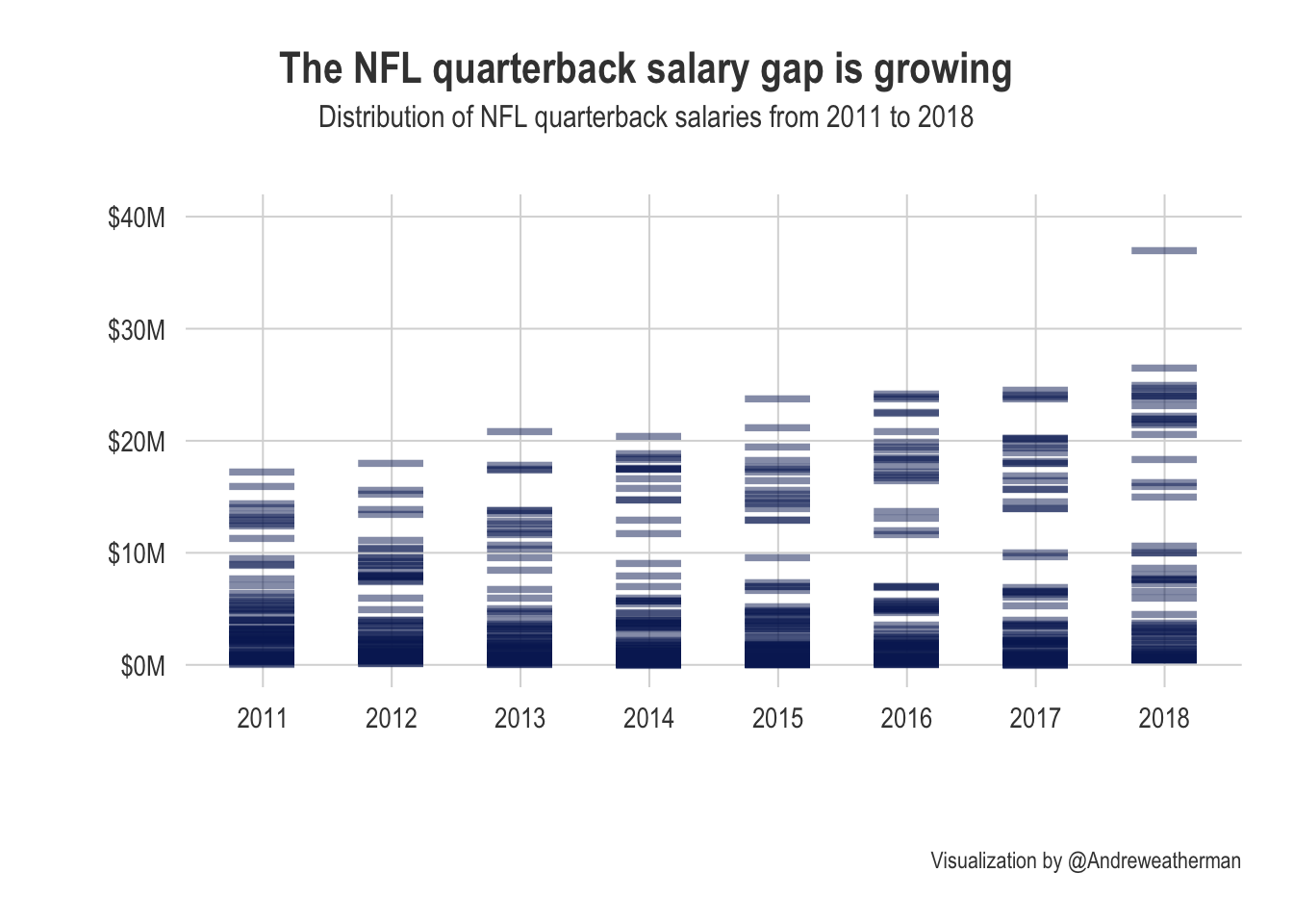
The spread of salaries appears to grow over time, and elite quarterbacks slowly raked in more money each season.
nfl |>
  filter(position == 'Quarterback') |>
  ggplot(aes(as.factor(year), salary)) +
  geom_point(shape=95,
             size=15,
             alpha=0.5,
             color='#0A2463') +
  scale_y_continuous(breaks=seq(0,40000000, 10000000),
                     labels = c('$0M', '$10M', '$20M', '$30M', '$40M'),
                     limits = c(0, 40000000)) +
  theme_pilot(
    title_family = font,
    subtitle_family = font,
    axis_title_family = font,
    axis_text_family = font,
    facet_title_family = font,
    caption_family = font
  ) +
  theme(plot.title.position = 'plot',
        plot.title=element_text(hjust=0.5),
        plot.subtitle = element_text(hjust=0.5)) +
  labs(
    title = 'The NFL quarterback salary gap is growing',
    subtitle='Distribution of NFL quarterback salaries from 2011 to 2018',
    caption = 'Visualization by @Andreweatherman',
    x = '',
    y=''
  )
Question 4:
nfl |>
  group_by(year, position) |>
  summarize(avg_salary = mean(salary, na.rm=TRUE))
# A tibble: 80 × 3
# Groups: year [8]
year position avg_salary
<dbl> <chr> <dbl>
1 2011 Cornerback 3037766.
2 2011 Defensive Lineman 4306995.
3 2011 Linebacker 4016045.
4 2011 Offensive Lineman 4662748.
5 2011 Quarterback 3376113.
6 2011 Running Back 1976341.
7 2011 Safety 2241891.
8 2011 Special Teamer 1244069.
9 2011 Tight End 1608100.
10 2011 Wide Receiver 2996590.
# … with 70 more rowsQuestion 5:
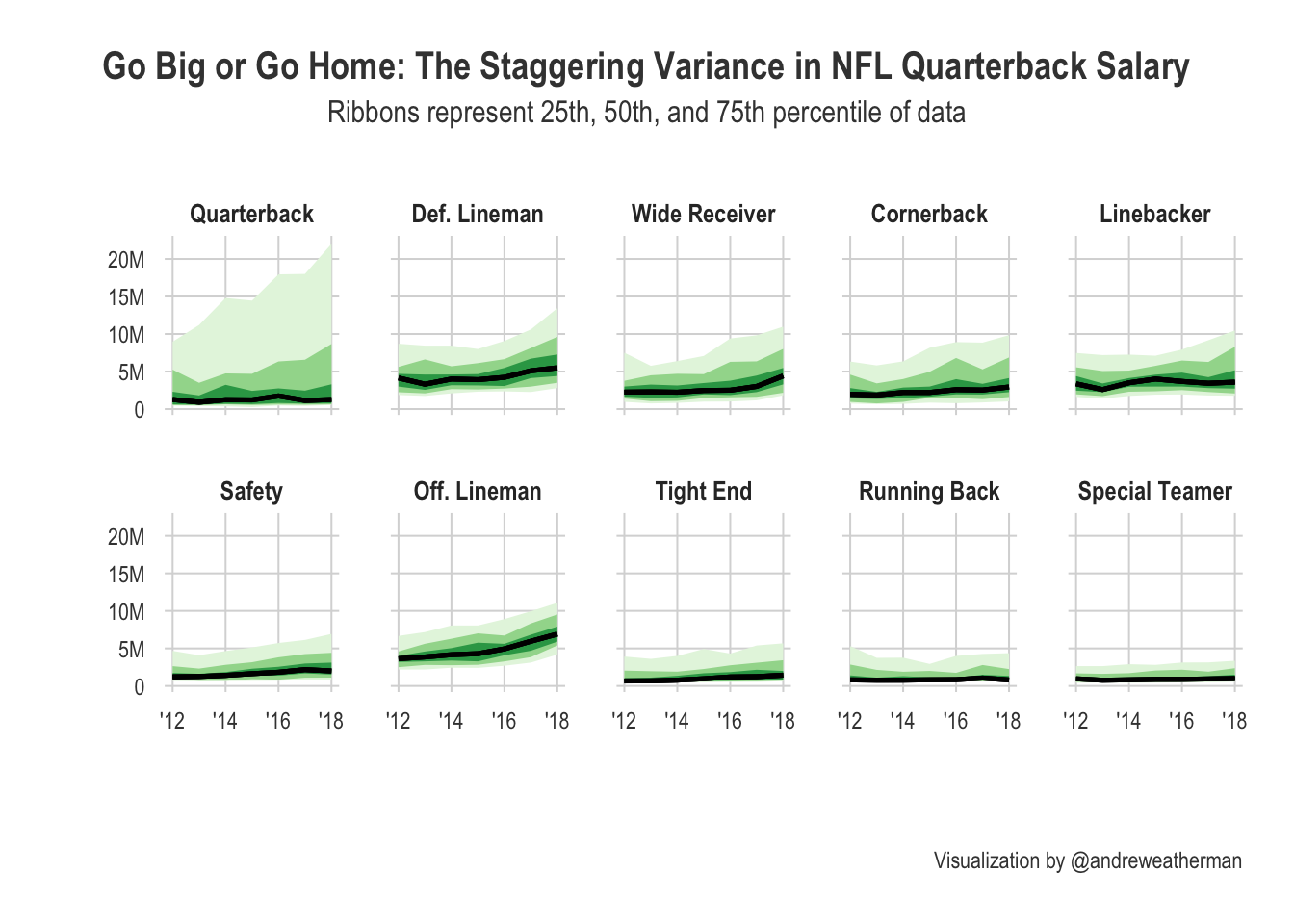
For this question, I decided to use the median salary data and not the average. Looking at the spread of the data, eliminating the outliers is probably better for accuracy. Also, I chopped of the 2011 season because the uneven axes were annoying me.
Prepare the data:
data <- nfl |>
  mutate(position = case_when(
           position == 'Defensive Lineman' ~ 'Def. Lineman',
           position == 'Offensive Lineman' ~ 'Off. Lineman',
           # new case_when syntax is so much better
           .default = position
         )) |>
  drop_na(salary) |>
  filter(year >= 2012) |>
  group_by(year, position) |>
  median_qi(salary, .width = c(.25, .50, .75))

levels <- data |>
  group_by(position, year) |>
  summarize(diff = max(.upper)-min(.lower)) |>
  mutate(var = var(diff)) |>
  arrange(desc(var)) |>
  distinct(position)
Plot the data:
data |>
  mutate(position = factor(position, levels=levels$position)) |>
  ggplot(aes(year, salary, ymin = .lower, ymax = .upper)) +
  geom_lineribbon(size=0.9) +
  scale_fill_brewer(palette = 'Greens') +
  scale_y_continuous(breaks = seq(0, 20000000, 5000000),
                     labels = c('0', '5M', '10M', '15M', '20M')) +
  scale_x_continuous(labels = c("'12", "'14", "'16", "'18")) +
  facet_wrap(~ position, nrow=2) +
  theme_pilot(
    # font
    title_family = font,
    subtitle_family = font,
    axis_title_family = font,
    axis_text_family = font,
    facet_title_family = font,
    caption_family = font,
    # text size
    title_size = 15,
    facet_title_size = 10,
    axis_text_size = 9
  ) +
  theme(
    legend.position = 'none',
    plot.title = element_text(hjust = 0.5),
    plot.title.position = 'plot',
    plot.subtitle = element_text(hjust=0.5)
  ) +
  labs(
    title = 'Go Big or Go Home: The Staggering Variance in NFL Quarterback Salary',
    subtitle = 'Ribbons represent 25th, 50th, and 75th percentile of data',
    caption = 'Visualization by @andreweatherman',
    x = '',
    y =''
  )