library(dplyr)
library(magrittr)
library(ggplot2)
library(pilot)
library(forcats)Week 6: SOC 223
Preparation
Load libraries:
Load the data:
tv <- readr::read_csv('https://github.com/NicolasRestrep/223_course/raw/main/Data/tv_ratings.csv')Create data frame for later use:
comedies_dramas <- tv |>
  mutate(is_comedy = if_else(stringr::str_detect(genres, "Comedy"),
                             1,
                             0)) |>
  filter(is_comedy == 1 | genres == "Drama") |>
  mutate(genres = if_else(genres == "Drama",
                          "Drama",
                          "Comedy"))
Chapter 4:
Question 1:
tv_long <- tv |>
  group_by(title) |>
  summarise(num_seasons = n()) |>
  ungroup() |>
  left_join(tv, by = "title")

tv_long <- tv_long |>
  filter(num_seasons >= 5)
It is difficult to make any conclusions because of how busy the plot is. A rough estimation would be that shows reach a critical peak within their first five seasons and slowly fall off from there.
tv_long |>
  ggplot(aes(seasonNumber, av_rating)) +
  geom_line(aes(group=title), alpha=0.15) +
  geom_smooth(method = 'gam', color = '#684551', fill='#D5B0AC') +
  scale_x_continuous(breaks=c(1, seq(5, 20, 5))) +
  theme_pilot() +
  labs(x = 'Season Number',
       y = 'Average Rating')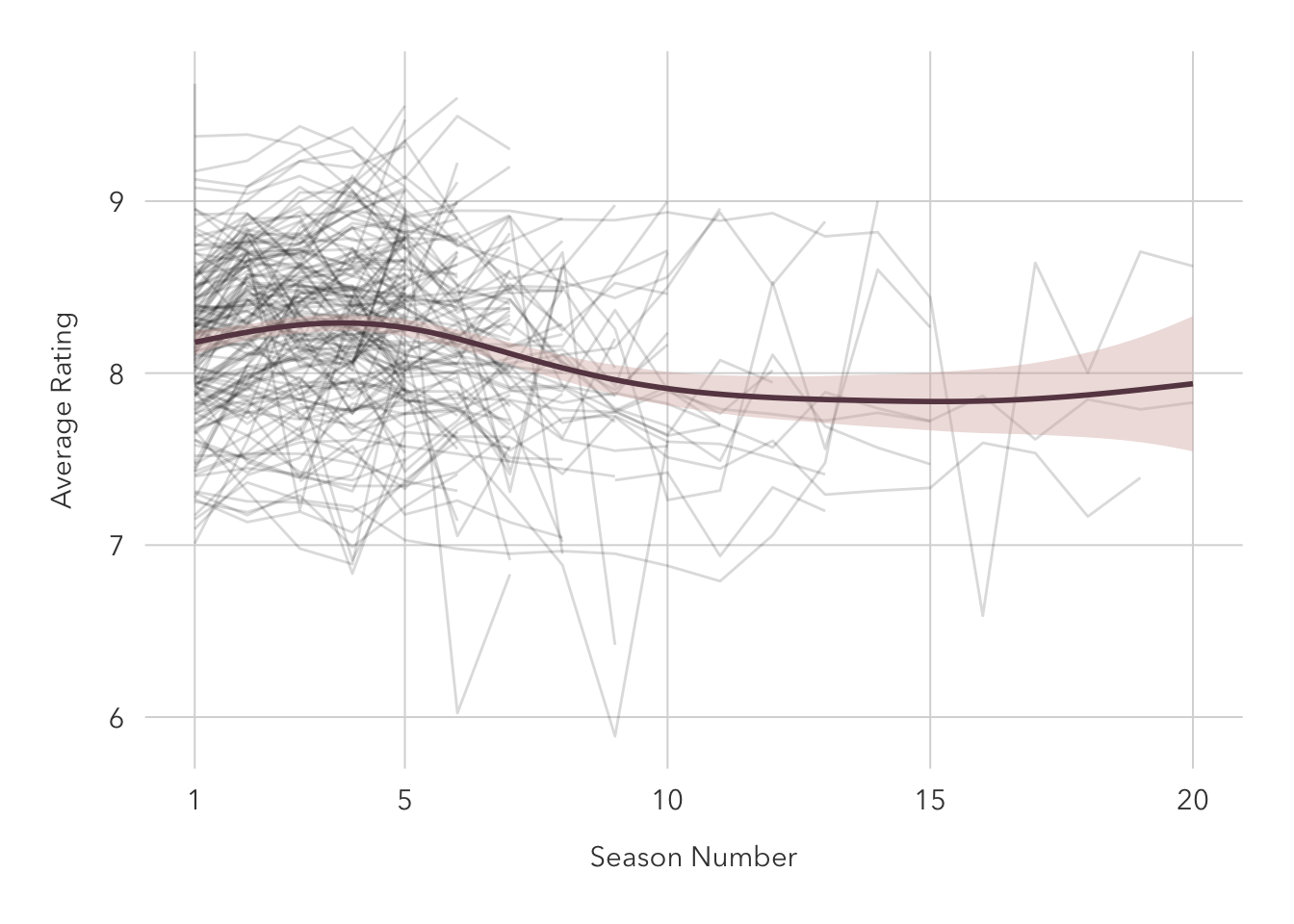
Question 2:
40-something genres made the plot too cluttered on my screen to draw any real conclusions, so I opted to take just the first two listed genres for each show and facet the plot accordingly.
Crime and drama shows tend to last the longest, and the ratings generally remain constant over time, but shorter-running shows occasionally see jumps in rating towards the end of their run.
tv_long |>
  group_by(titleId) |>
  mutate(two_genres = toString(head(strsplit(genres, ',')[[1]], 2))) |>
  ggplot(aes(seasonNumber, av_rating)) +
  geom_line(aes(group=title), alpha=0.25, color='#684551') +
  scale_x_continuous(breaks=c(1, seq(5, 20, 5))) +
  facet_wrap(~ two_genres) +
  theme_pilot(
    facet_title_size = 7,
    axis_text_size = 7,
    title_size = 14
  ) +
  theme(plot.title.position = 'plot') +
    labs(x = 'Season Number',
         y = 'Average Rating',
         title = 'Long-running action and crime shows age well over time',
         subtitle = 'Average ratings for TV shows that aired for five or more seasons',
         caption = 'Data from IMDB')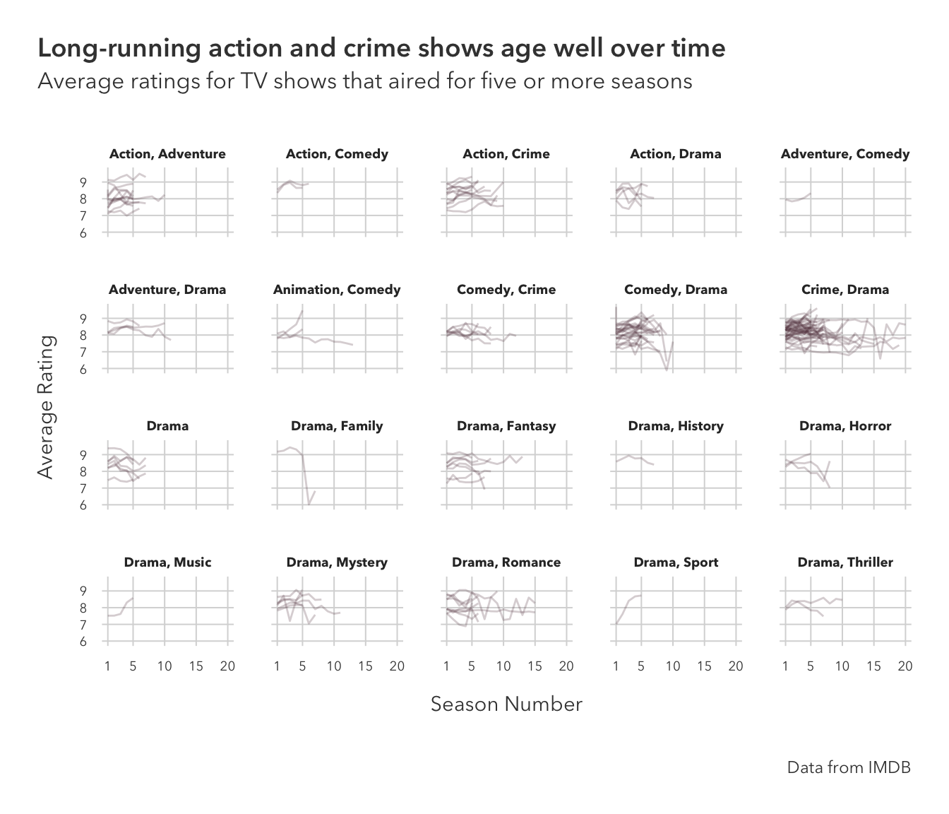
There is only one show that falls under the Drama, Family, and Friends category: Are You Afraid of the Dark?
tv_long |>
  filter(genres == 'Drama,Family,Fantasy') |>
  purrr::pluck(1) |>
  unique()
[1] "Are You Afraid of the Dark?"Question 3:
Keeping with the theme of the last question, I am restricting this to including just the first two listed genres. 40-plus categories is just a few too many.
coord_flip inverts the axes. The genre with the top-rated shows is Crime and Drama.
tv |>
  filter(av_rating >= 9) |>
  group_by(titleId) |>
  mutate(two_genres = toString(head(strsplit(genres, ',')[[1]], 2))) |>
  ggplot(aes(fct_rev(fct_infreq(two_genres)))) +
  geom_bar(fill = '#684551') +
  coord_flip() +
  theme_pilot(title_size = 14) +
  theme(plot.title.position = 'plot') +
  labs(x = '',
       y = 'Number of Shows',
       title = 'Crime and drama shows are critically successful',
       subtitle = 'Number of shows by genre that achieved an average IMBD rating of nine or higher',
       caption = 'Data by IMBD')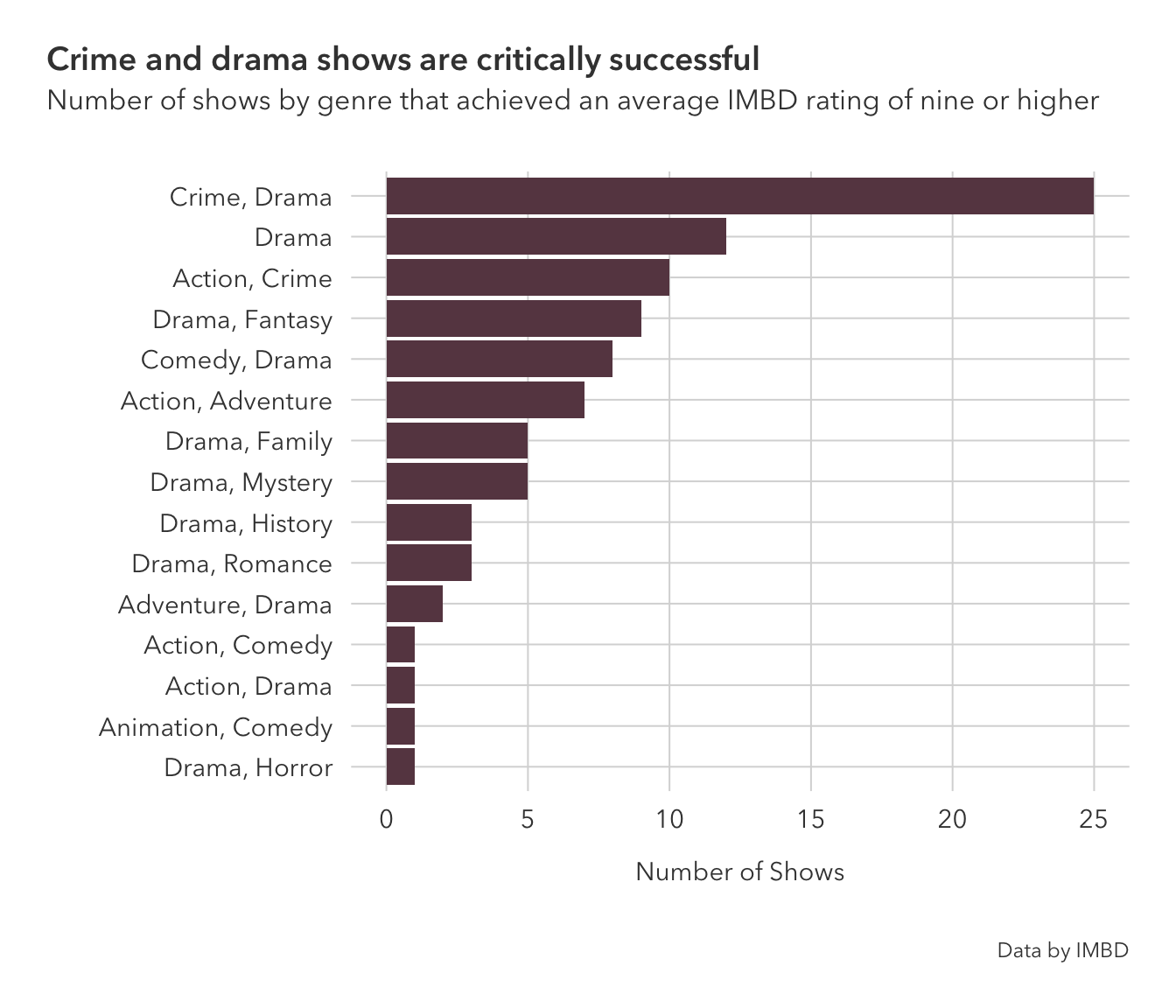
Question 4:
Drama shows are not necessarily rated higher than comedy ones, the mean between the two are roughly the same, but drama show ratings tend to be clustered around the same rating. This might lead to the perception that dramas are rated higher, as fewer are ‘busts’ or ‘hits.’
comedies_dramas |>
  ggplot(aes(av_rating, fill=genres)) +
  geom_density(alpha=0.6, size=0.85) +
  scale_fill_manual(values=c('#7678ED', '#3D348B')) +
  theme_pilot() +
  theme(plot.title.position = 'plot',
        legend.position = c(0.15, 0.8)) +
  labs(x='Average Rating',
       y = 'Kernal Density Estimate',
       fill = 'Series Genre',
       title = 'Drama shows are more critically stable than comedy ones',
       subtitle = 'Density plot of IMBD rated-television shows that are classified as dramas or comedies',
       caption = 'Data from IMBD')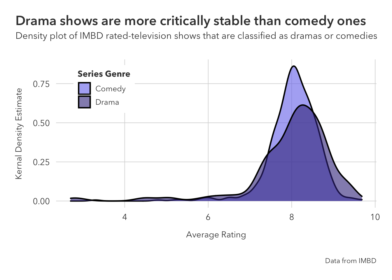
Question 5:
Histograms show us the number of total observations in the data set, while the density plot was not giving us that information. Without seeing this histogram or the data, the reader might assume that the number of shows were around the same.
comedies_dramas |>
  ggplot(aes(av_rating, fill=genres)) +
  geom_histogram() +
  scale_fill_manual(values=c('#7678ED', '#3D348B')) +
  theme_pilot()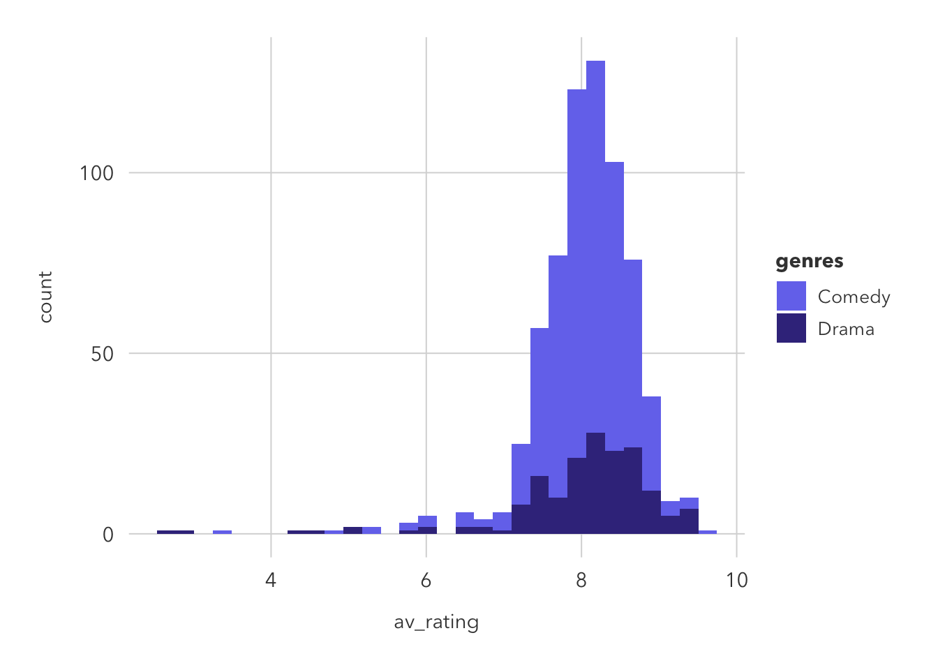
This is similar to geom_density and geom_histogram in that is shows the total observations but is smoothed over (unlike histogram).
I would probably prefer to use geom_freqpoly. Both the histogram and density plot have their uses, but I think that geom_freqpoly is a good mix of the two’s biggest advantages. Showing the count is important.
comedies_dramas |>
  ggplot(aes(av_rating, color=genres)) +
  geom_freqpoly() +
  scale_color_manual(values=c('#7678ED', '#3D348B')) +
  theme_pilot() +
    theme(plot.title.position = 'plot',
        legend.position = c(0.13, 0.75)) +
  labs(x='Average Rating',
       y = 'Total Shows',
       color = 'Series Genre',
       title = 'Drama shows are more critically stable than comedy ones',
       subtitle = 'Frequency plot of IMBD rated-television shows that are classified as dramas or comedies',
       caption = 'Data from IMBD')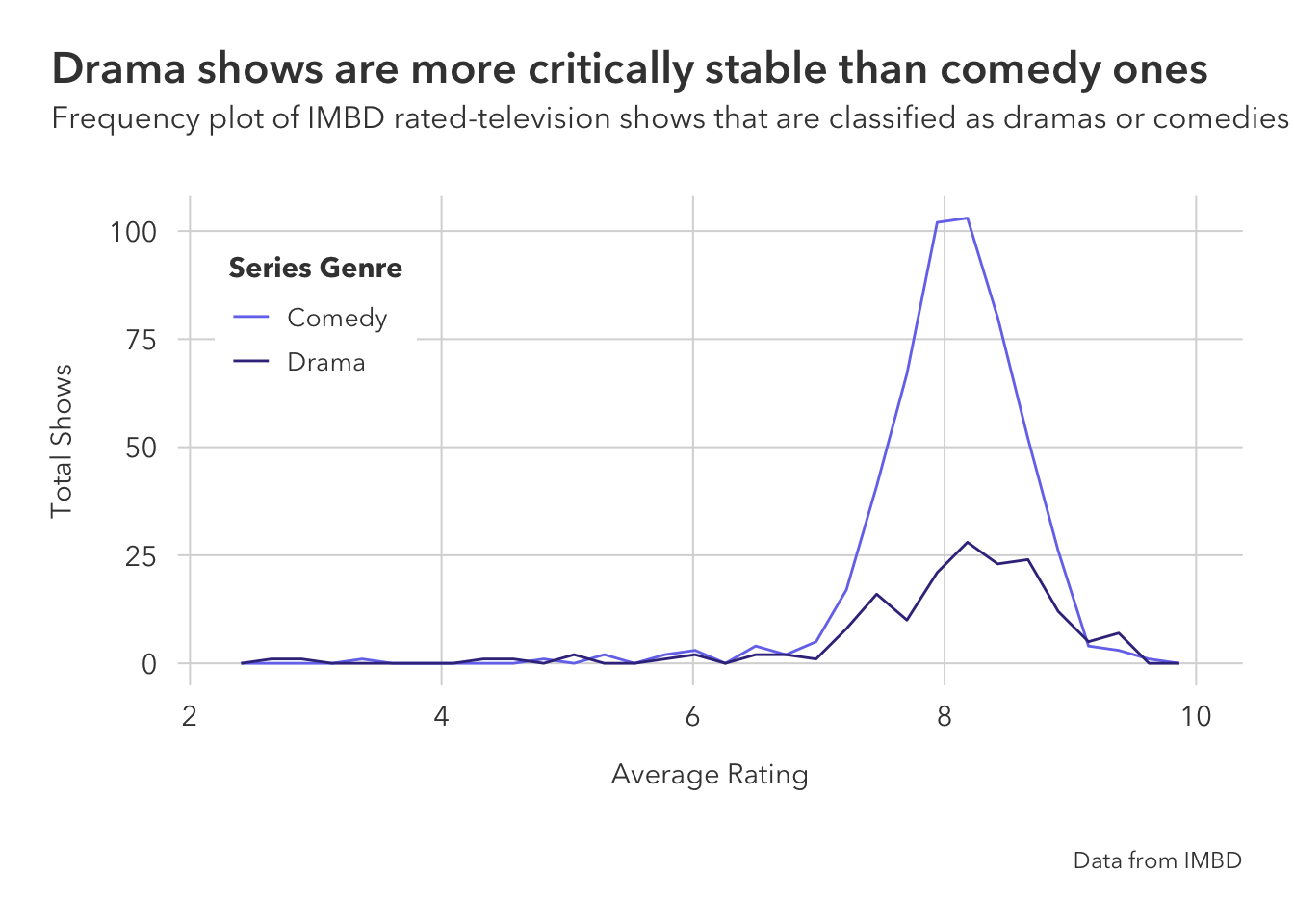
Question 6:
A heatmap is good when you want to fill by a numeric variable that should be on a gradient. In this particular example, we are able to ‘bin off’ areas of the plot to see the number of shows that fell under each ‘bin’ (viewership and share combination).
comedies_dramas |>
  ggplot(aes(av_rating, share)) +
  geom_bin_2d() +
  facet_wrap(~genres) +
  theme_pilot() +
  scale_fill_gradient(low='#342C77', high='#A5A6F3',
                      breaks=seq(0,80,80),labels=c("Fewer Shows","More Shows"),
                      limits = c(0,80)) +
  theme(
    legend.position = 'top',
    legend.key.width = unit(0.75, 'cm'),
    legend.key.height = unit(0.25, 'cm'),
    plot.title = element_text(hjust=0.5),
    plot.subtitle = element_text(hjust=0.5),
    strip.text = ggtext::element_textbox(
      size = 10,
      color = "white", fill = "#3D348B", box.color = "#4A618C",
      halign = 0.5, linetype = 1, r = unit(5, "pt"), width = unit(1, "npc"),
      padding = margin(2, 0, 1, 0), margin = margin(3, 3, 3, 3)
    )
  ) +
  labs(x='Average Rating',
       y = 'Share of Viewership',
       fill = '',
       title = 'Critically successful comedy shows get little viewers',
       subtitle = 'Heatmap of viewership and IMBD ratings for comedy and drama shows',
       caption='Data from IMBD')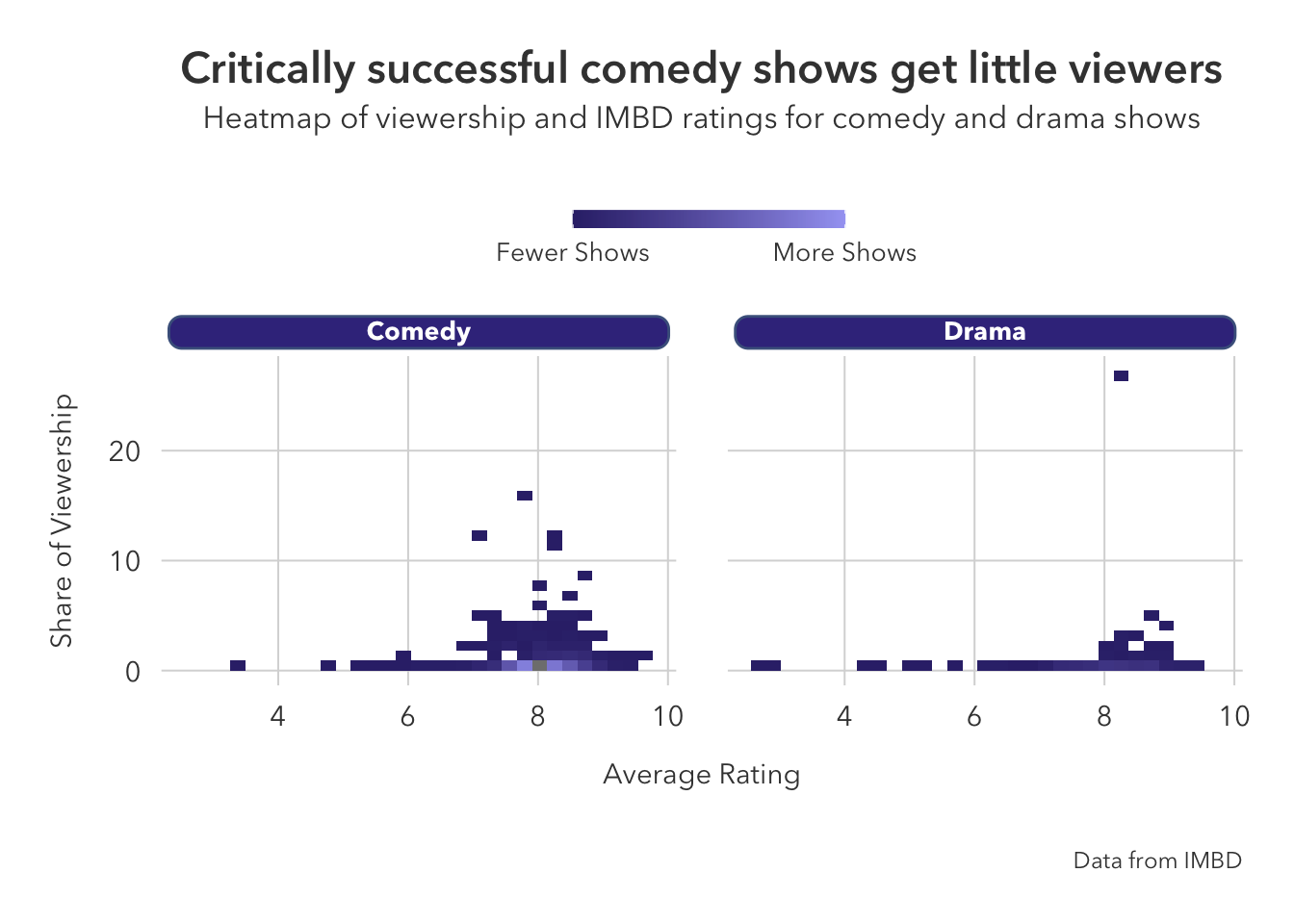
The outlying drama show was the first season of Dekalog in 1990.
comedies_dramas |>
  slice(which.max(share)) |>
  purrr::pluck(3)
[1] "Dekalog"Chapter 5:
Preparation
Load the data:
ncaa <- readr::read_csv('https://github.com/NicolasRestrep/223_course/raw/main/Data/wncaa.csv')Create the ‘winners’ data frame:
champ_names <- ncaa |> filter(tourney_finish == 'Champ') %$% {unique(.$school)}
winners <- ncaa |>
  filter(school %in% champ_names) |>
  group_by(school) |>
  mutate(champ = sum(tourney_finish == 'Champ')) |>
  ungroup() |>
  mutate(school = case_when(
           school == 'Southern California' ~ 'USC',
           .default = school
         )) |>
  left_join(cfbplotR::logo_ref |> select(school, color))
Question 1
ncaa |>
  filter(tourney_finish == 'Champ') |>
  count(school) |>
  # change Southern Cal. to USC
  mutate(prop = n / sum(n),
         label = ifelse(n == max(n), paste0(n, ' championships won '), paste0(n, ' ')),
         school = case_when(
           school == 'Southern California' ~ 'USC',
           .default = school
         )) |>
  left_join(cfbplotR::logo_ref |> select(school, color)) |>
  ggplot(aes(prop, reorder(school, prop), fill = color)) +
  geom_bar(stat='identity') +
  geom_text(aes(label=label),
            hjust = 1,
            fontface = "bold",
            family='Avenir Next',
            color = "white",
            size = 3.5) +
  scale_x_continuous(labels = scales::label_percent()) +
  scale_fill_identity() +
  theme_pilot() +
  theme(plot.title.position = 'plot') +
  labs(y='',
       x = 'Percentage of tournaments won',
       title = "UConn and Tennessee dominate women's basketball",
       subtitle = 'Proportion of NCAA tournaments won by program (1982-2018)')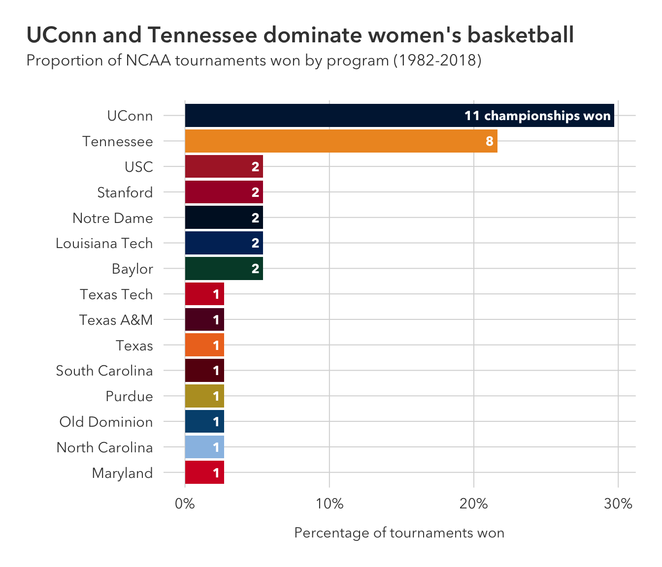
Question 2:
winners |>
  ggplot(aes(seed, reorder(school, champ), fill=color)) +
  geom_boxplot(alpha = .5, size = 0.5, outlier.size = 2) +
  scale_fill_identity() +
  scale_x_continuous(breaks=c(1, seq(5, 15, 5), 15),
                     limits = c(1, 15)) +
  theme_pilot() +
  theme(plot.title.position = 'plot') +
  labs(x = 'Seed',
       y = '',
       title = 'UConn and Tennessee dominate the top seed line',
       subtitle = "Distribution of NCAA tournament seeds for previous women's champions (1982-2018). \nTeams are ordered by number of championships won.")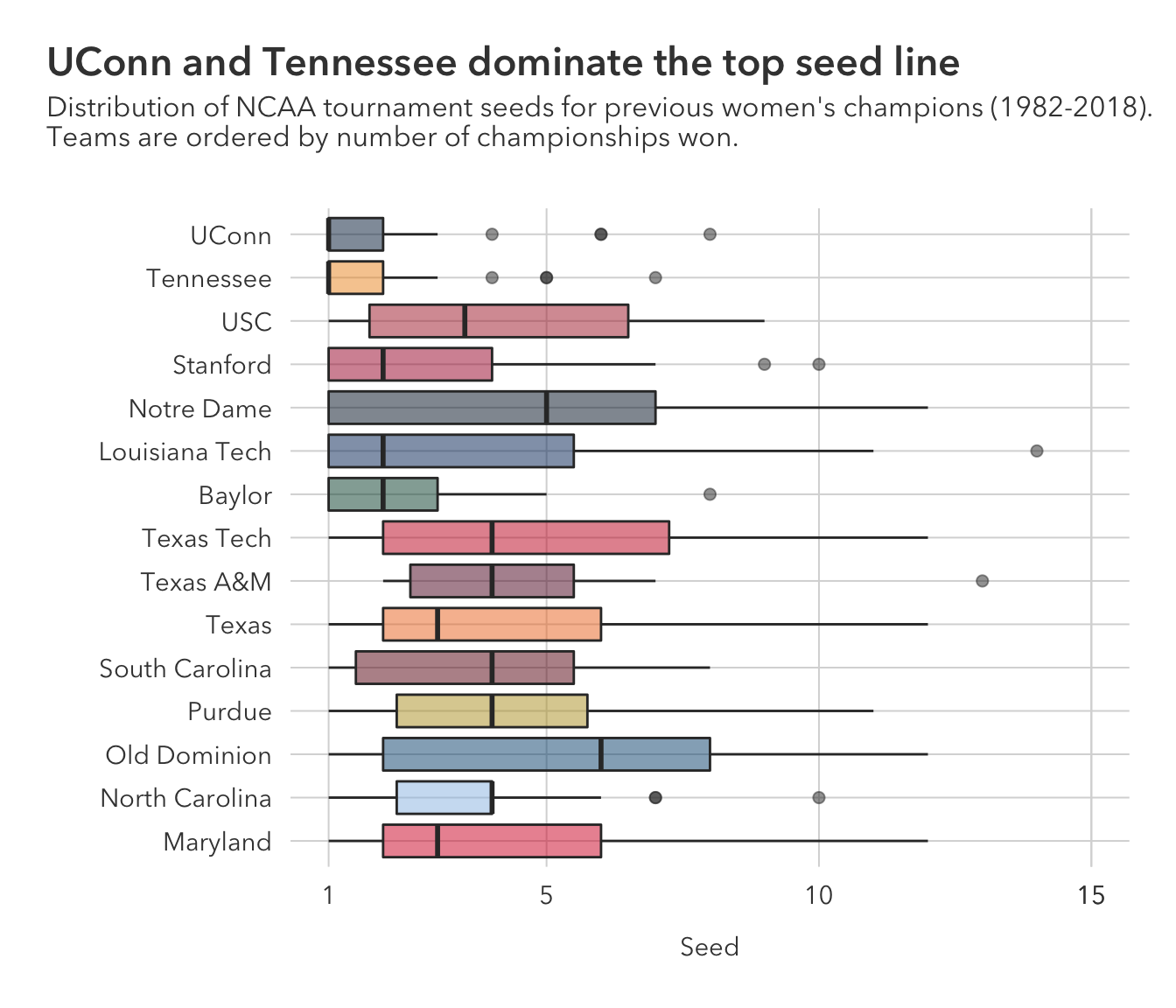
geom_violin is one of the many fun alternatives to box plots, but I generally prefer something from the {ggdist} package. For this case where there are not too many observations per team, I would lean towards using the above box plot.
winners |>
  ggplot(aes(seed, reorder(school, champ), fill=color)) +
  geom_violin(size = 0.6, bw = .2) +
  scale_fill_identity() +
  scale_x_continuous(breaks=c(1, seq(5, 15, 5), 15),
                     limits = c(1, 15)) +
  theme_pilot() +
  theme(plot.title.position = 'plot') +
  labs(x = 'Seed',
       y = '',
       title = 'UConn and Tennessee dominate the top seed line',
       subtitle = "Distribution of NCAA tournament seeds for previous women's champions (1982-2018). \nTeams are ordered by number of championships won.")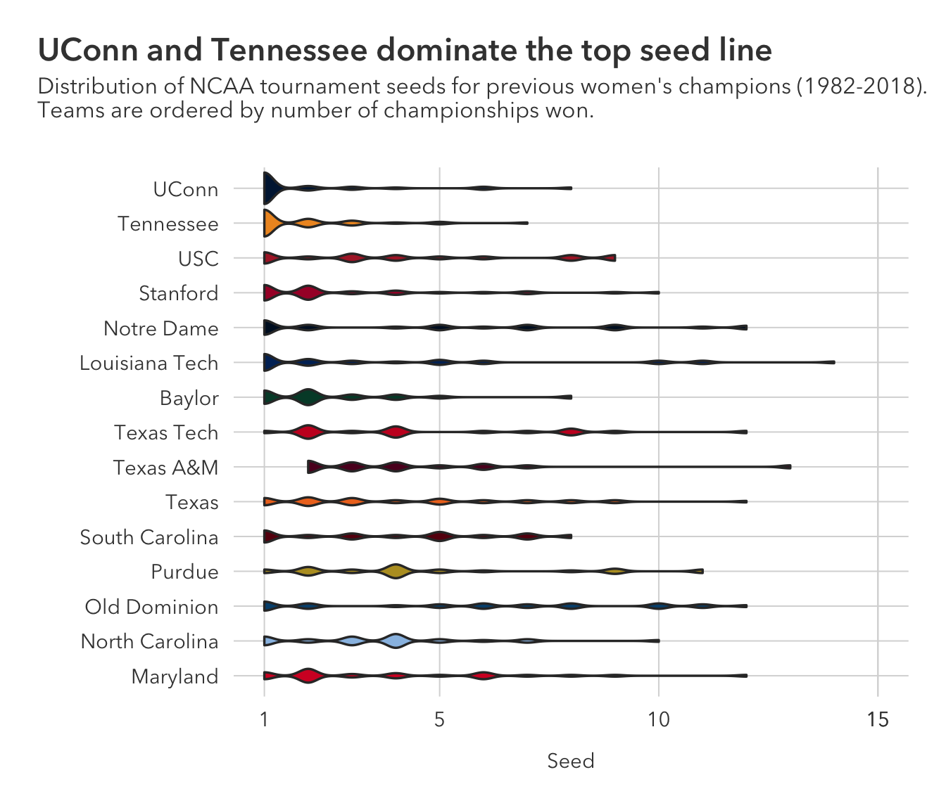
Question 3:
geom_point does a poor job at handling clumped data // overplotting. This can be slightly fixed by jittering the points with something like geom_quasirandom, but even then, it is not nearly as good as a boxplot at showing clumped distribution using one numeric variable.
And at that, plotting one integer exacerbates this issue because an excess of one value might lead to that value ‘bleeding over’ into space where one might expect the next integer to be graphed.
winners |>
  ggplot(aes(seed, reorder(school, champ), color=color)) +
  ggbeeswarm::geom_quasirandom(alpha = 0.5) +
  scale_color_identity() +
  scale_x_continuous(breaks=c(1, seq(5, 15, 5), 15),
                     limits = c(1, 15)) +
  theme_pilot() +
  theme(plot.title.position = 'plot') +
  labs(x = 'Seed',
       y = '',
       title = 'UConn and Tennessee dominate the top seed line',
       subtitle = "Distribution of NCAA tournament seeds for previous women's champions (1982-2018). \nTeams are ordered by number of championships won.")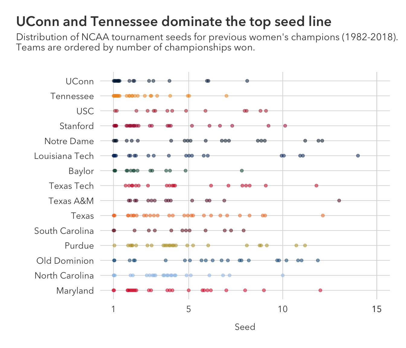
Question 4:
summarize_if is superseeded in favor of across:
sum_across <- winners |>
  group_by(school) |>
  mutate(champs = n()) |>
  summarize(across(where(is.numeric), list(mean=~mean(.x), sd=~sd(.x)))) |>
  left_join(winners |> select(school, champ, color)) |>
  unique()
So, I added a geom_point layer on top of geom_pointrange, which effectively treats the latter as geom_linerange, as to have access to the size parameter to scale the observations by number of championships won – a variable I created above. The size parameter passed through to geom_pointrange, instead, sizes both the line and the point.
sum_across |>
  ggplot(aes(reg_percent_mean, reorder(school, reg_percent_mean))) +
  geom_point(aes(size=champs_mean, color = color)) +
  geom_pointrange(aes(xmin = reg_percent_mean - reg_percent_sd,
                      xmax = reg_percent_mean + reg_percent_sd,
                      color = color)) +
  scale_color_identity() +
  scale_x_continuous(labels=scales::label_percent(scale=1)) +
  theme_pilot(title_size = 12) +
  theme(plot.title.position = 'plot',
        legend.position = 'none') +
  labs(x = 'Average Reg. Season Win Percentage',
       y='',
       title = "The Huskies are as successful in the reg. season as they are in the post season",
       subtitle = "Average regular season win percentage for national championship-winning Division 1 \nwomen's basketball programs from 1982 to 2018. Points sized by titles won.")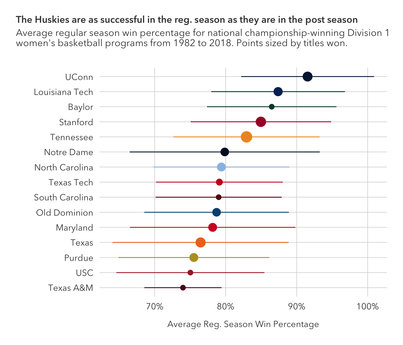
The average win percentages are relatively consistent, and when you consider the number of games played in the regular season, the difference in win percentage would likely boil down to just a game or two.
As I mentioned above, adding a geom_point layer effectively treats geom_pointrange as geom_linerange, so just replacing the former with the latter would be how to create the above plot with geom_linerange.
Question 5:
winners |>
  ggplot(aes(reg_percent, full_percent)) +
  geom_point() +
  geom_abline()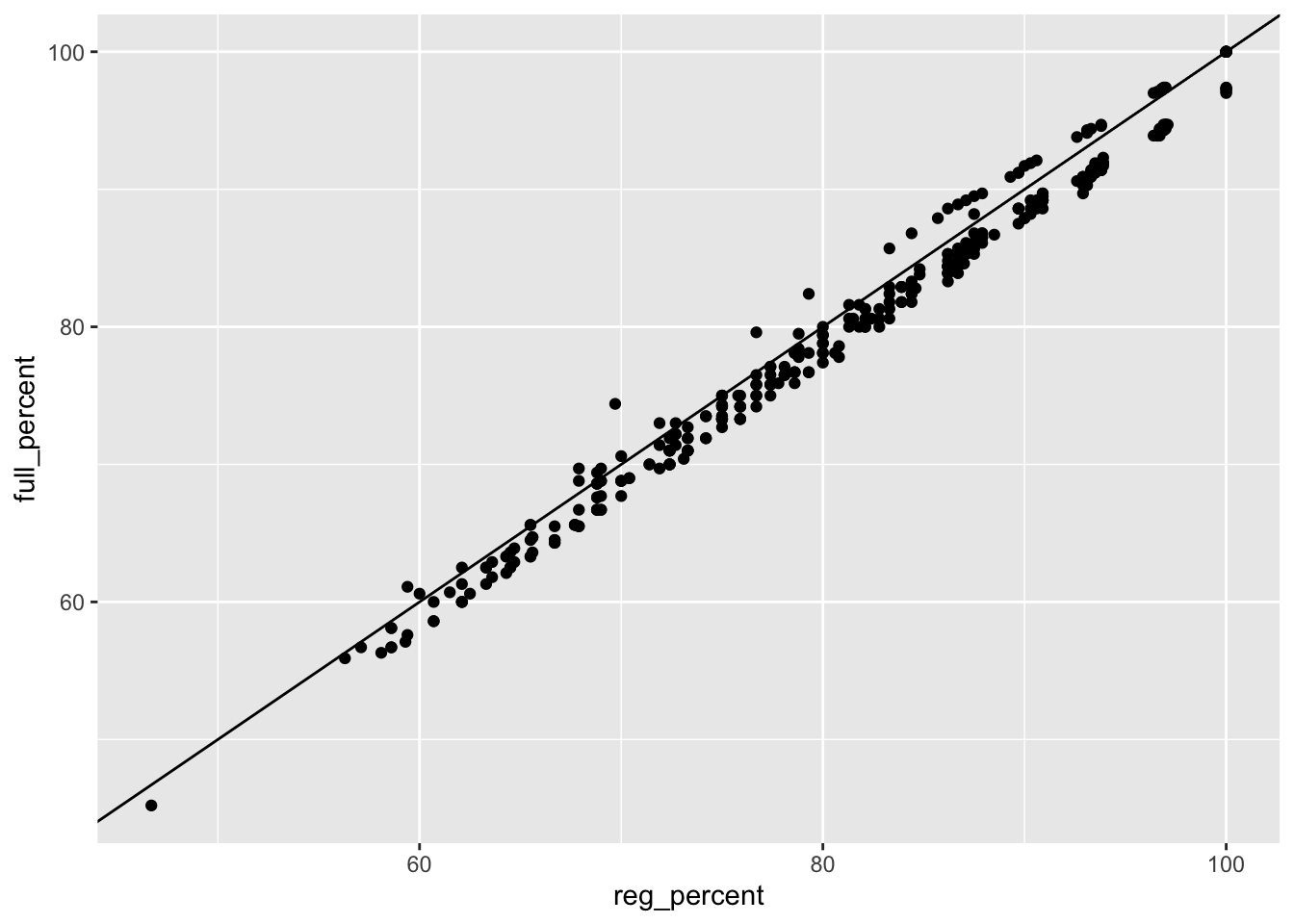
We notice that many points are below the expected line. This lends credence to the idea that a 45-degree prediction line is not a great fit. This is to be expected as the general consensus is that a single-elimination tournament, as is the NCAA tournament, is not a great predictor of true team strength – slightly less-so for the women’s side of basketball but still stands. There is also the confounding variable of schedule strength.
Question 6:
winners |>
  mutate(is_champ = if_else(tourney_finish == "Champ", 1, 0),
         is_champ = as.factor(is_champ)) |>
  ggplot(aes(reg_percent, full_percent)) +
  geom_point(aes(color=is_champ)) +
  geom_abline()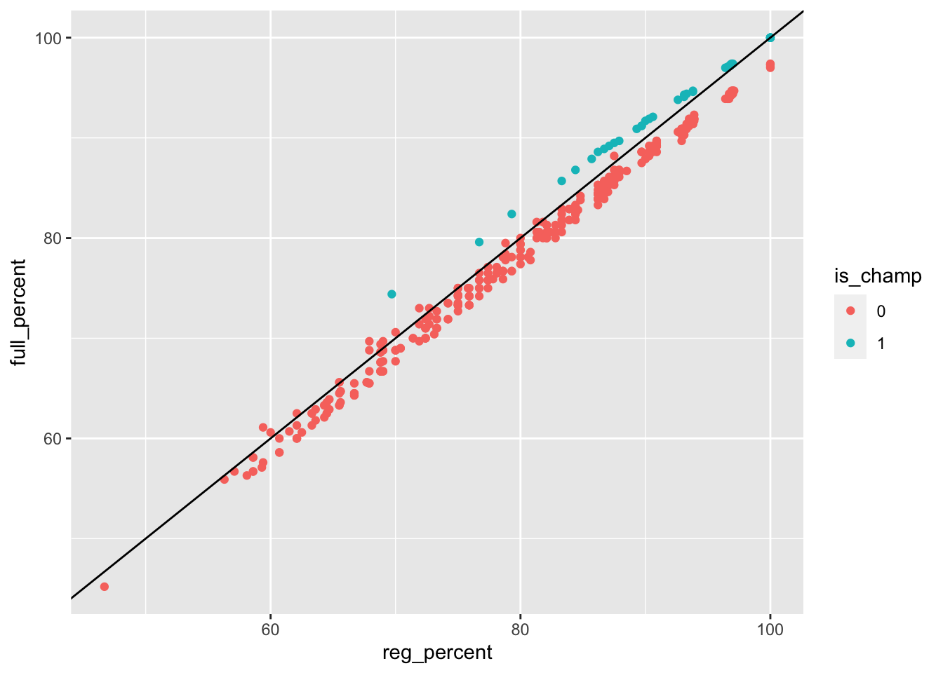
As to be expected, as champions have inherently ‘overperformed,’ a majority of the observations that lie above the predictor line were championship seasons.
Coding the is_champ variable as a factor allows ggplot2 to treat the fill aesthetic as a discrete one, not a continuous one. Coding is_champ as a logical (true/false) or as a character (‘1’, ‘0’; ‘yes’, ‘no’; etc.) would remove the necessity for factorizing is_champ and remove one line of code.
Question 7:
winners <- winners %>%
  mutate(is_champ = if_else(tourney_finish == "Champ", TRUE, FALSE),
         difference = full_percent - reg_percent)
winners |>
mutate(
case_when(
is_champ == TRUE & reg_percent == min(subset(winners, is_champ == TRUE)$reg_percent) ~ tibble(label = paste0(school, '; ', year), hjust=1.45, vjust=-1.5),
reg_percent == min(winners$reg_percent) ~ tibble(label = paste0(school, '; ', year), hjust=-0.5, vjust=0.0)
)) |>
ggplot(aes(reg_percent, full_percent, label=label, hjust=hjust, vjust=vjust)) +
geom_smooth(method = 'gam', se = FALSE, color='#0B3142', alpha=0.7) +
geom_point(aes(color=is_champ), alpha=0.7, size=1.8) +
annotate(geom='curve', x=70, y=75, xend=65, yend=85, curvature=0.5, arrow=arrow(length=unit(.2, 'cm'))) +
annotate(geom='curve', x=48, y=45, xend=53, yend=46, arrow=arrow(length=unit(.2, 'cm'))) +
ggtext::geom_richtext() +
scale_x_continuous(labels=scales::label_percent(scale=1)) +
scale_y_continuous(labels=scales::label_percent(scale=1)) +
scale_color_manual(values=c('#81667A', '#048A81')) +
theme_pilot() +
theme(legend.position = 'none',
plot.title = ggtext::element_markdown(size=13),
plot.title.position = 'plot') +
labs(x = 'Reg. Season Win Percentage',
y = 'Final Win Percentage',
title = "<span style='color: #048A81;'>Tournament Champions<span style='color: black;'> vs. <span style='color: #81667A;'>Tournament Losers:<span style='color: black;'> Season Win Percentage",
subtitle = "A look at regular season and total win percentage for women's basketball teams who \nhave won at least one championship from 1982 to 2018")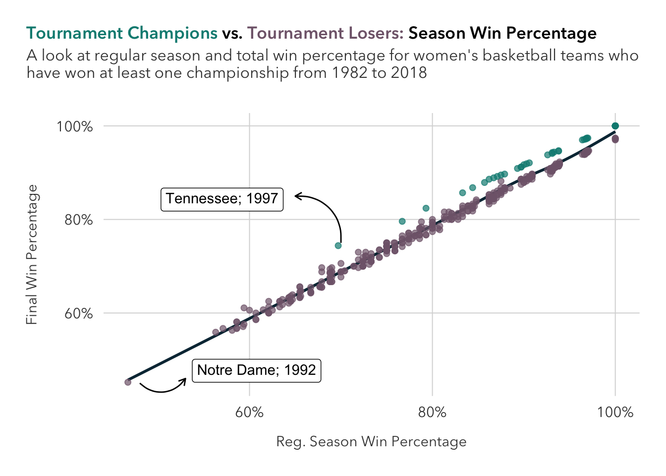
No, I don’t see anything new that jumps out since the last question.
Question 8:
Surprising to no one who is familiar with women’s basketball, UConn has gone unbeaten six times.
winners |>
  filter(full_percent == 100) |>
  select(school, full_w, year)
# A tibble: 8 × 3
school full_w year
<chr> <dbl> <dbl>
1 Texas 34 1986
2 UConn 35 1995
3 UConn 39 2002
4 UConn 39 2009
5 UConn 39 2010
6 Baylor 40 2012
7 UConn 40 2014
8 UConn 38 2016