twitch <- readr::read_csv('https://github.com/NicolasRestrep/223_course/raw/main/Data/twitchdata-update.csv') |>
  janitor::clean_names()

twitch <- twitch %>%
  mutate(log_viewers = log(average_viewers),
log_followers = log(followers))Week 7: SOC 223
Preparation
Load the data:
Question 1:
Average viewers and followers for five random streamers:
set.seed(1)
twitch |>
  slice_sample(n=5) |>
  select(channel, average_viewers, followers)
# A tibble: 5 × 3
channel average_viewers followers
<chr> <dbl> <dbl>
1 FanHOTS 1090 64587
2 fuslie 2504 336394
3 WePlayEsport_EN 6127 175061
4 Wackyjacky101 1012 209700
5 GTimeTV 1022 665021I notice that the average viewers and followers are widely distributed.
set.seed(1)
twitch |>
  slice_sample(n=5) |>
  select(channel, average_viewers, followers) |>
  summary()
channel average_viewers followers
Length:5 Min. :1012 Min. : 64587
Class :character 1st Qu.:1022 1st Qu.:175061
Mode :character Median :1090 Median :209700
Mean :2351 Mean :290153
3rd Qu.:2504 3rd Qu.:336394
Max. :6127 Max. :665021 The distribution appears slightly larger for the followers variable, but neither has a particularly narrow spread.
set.seed(1)
twitch |>
  slice_sample(n=5) |>
  select(channel, average_viewers, followers) |>
  ggplot(aes(average_viewers, followers)) +
  geom_point() +
  scale_y_continuous(labels = scales::comma_format()) +
  pilot::theme_pilot() +
  labs(x = 'Average Viewers',
       y = 'Followers')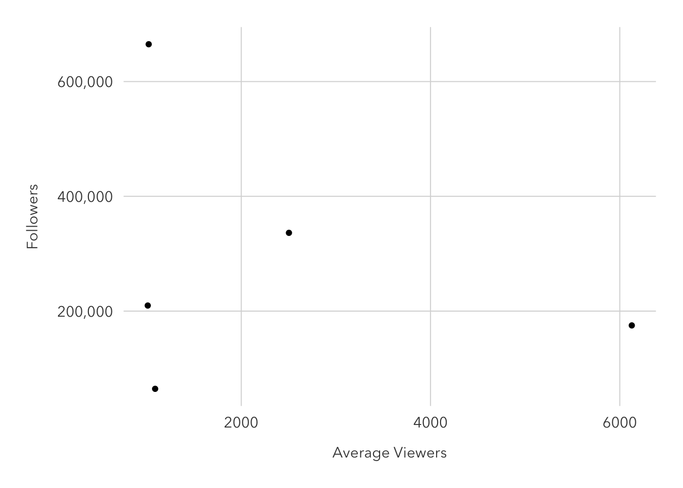
I notice that there are two major outliers. One channel has many followers but average very little viewers per stream, while the other averages the most viewers in the sample but has the second-lowest follower count.
set.seed(1)
twitch |>
  slice_sample(n=5) |>
  select(channel, average_viewers, followers) |>
  ggplot(aes(average_viewers, followers)) +
  geom_point() +
  scale_x_log10() +
  scale_y_log10(labels = scales::comma_format()) +
  pilot::theme_pilot() +
  labs(x = 'Average Viewers',
       y = 'Followers')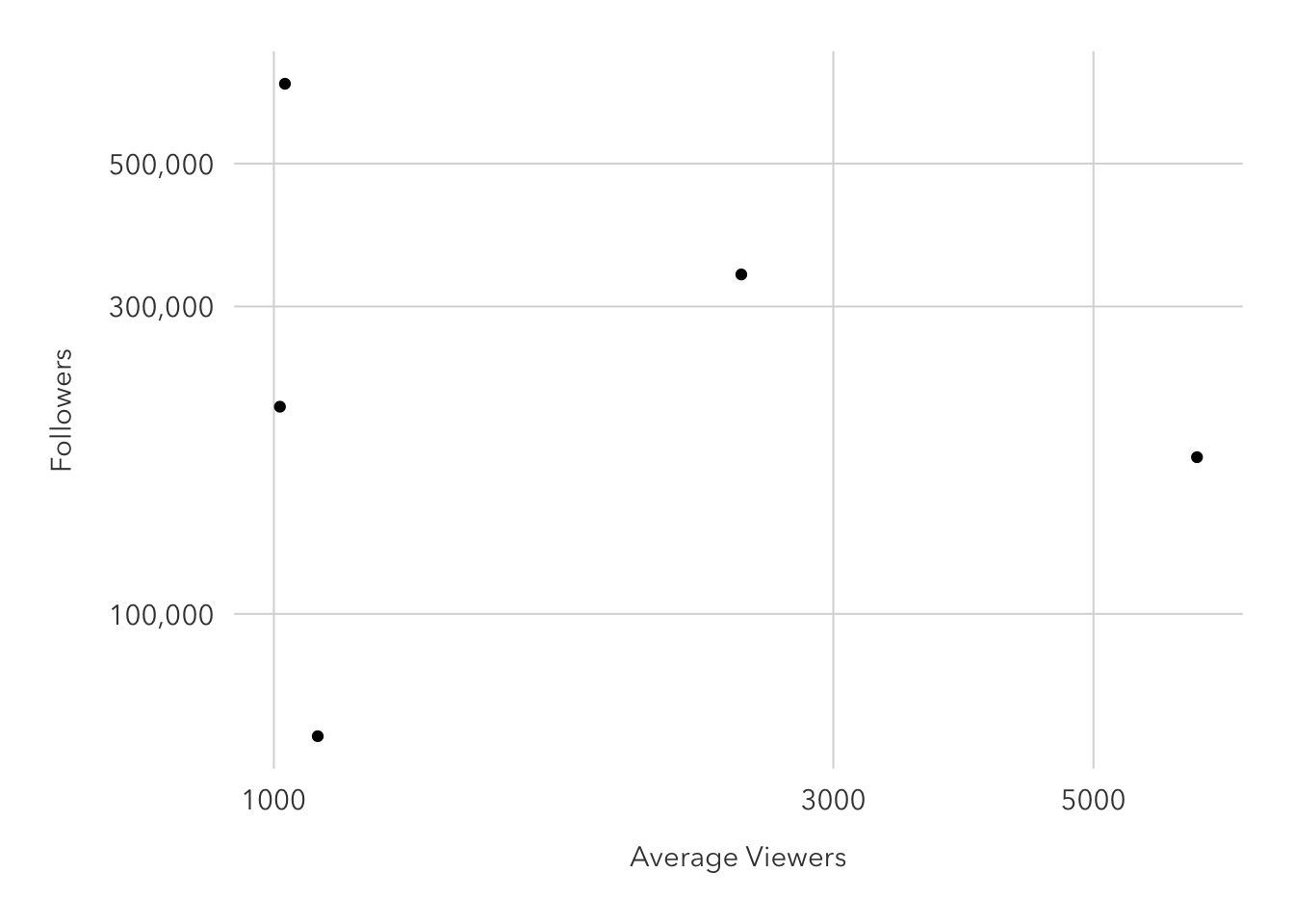
Turning the axes into logs makes a trend a bit more visible, with a positive association. But with just five observations, the graph does not look good (hence my reluctance to spice up the graph itself) and no statistical conclusion can be reliably drawn with such few points.
Question 2:
fit1 <- lm(data=twitch, log_viewers ~ log_followers)
tidy(fit1)
# A tibble: 2 × 5
term estimate std.error statistic p.value
<chr> <dbl> <dbl> <dbl> <dbl>
1 (Intercept) 0.456 0.288 1.58 1.15e- 1
2 log_followers 0.588 0.0226 26.0 1.69e-114A 10% increase in followers is associated with a 5.8% increase in the average number of viewers.
Question 3:
augment(fit1)# A tibble: 1,000 × 8
log_viewers log_followers .fitted .resid .hat .sigma .cooksd .std.resid
<dbl> <dbl> <dbl> <dbl> <dbl> <dbl> <dbl> <dbl>
1 10.2 15.0 9.28 0.951 0.00619 0.710 0.00561 1.34
2 10.2 15.5 9.57 0.582 0.00869 0.711 0.00297 0.823
3 9.30 14.4 8.92 0.382 0.00378 0.711 0.000551 0.539
4 8.95 15.2 9.39 -0.443 0.00713 0.711 0.00140 -0.625
5 10.3 16.0 9.87 0.421 0.0119 0.711 0.00213 0.595
6 10.7 14.3 8.85 1.81 0.00339 0.709 0.0110 2.55
7 10.1 15.2 9.41 0.681 0.00729 0.711 0.00339 0.961
8 9.85 13.1 8.19 1.66 0.00117 0.709 0.00322 2.34
9 10.0 15.1 9.33 0.688 0.00659 0.711 0.00312 0.971
10 9.42 14.8 9.15 0.274 0.00524 0.711 0.000393 0.386
# … with 990 more rowspred_data <- augment(fit1)pred_data |>
ggplot(aes(x = log_followers,
y = log_viewers)) +
geom_jitter(alpha = 0.4) +
geom_line(aes(x = log_followers,
y = .fitted),
col = "orange") +
theme_minimal() +
labs(subtitle = "Fitted Model and Raw Data",
title = "Followers & Average Viewership",
x = "log(followers)",
y = "log(viewers)")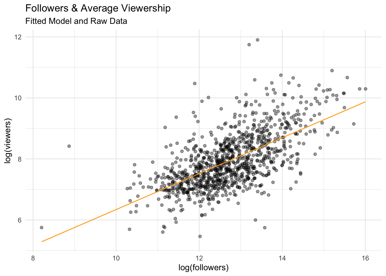
The model describes the data fairly well. Most of the points are clumped around the prediction line, and there are few outliers.
pred_data |>
  ggplot(aes(x = log_followers,
             y = .resid)) +
  geom_jitter(alpha = 0.4) +
  geom_hline(yintercept = 0) +
  theme_minimal() +
  labs(subtitle = "Residual line",
       title = "Followers & Average Viewership",
       x = "log(followers)",
       y = "Fitted Residuals")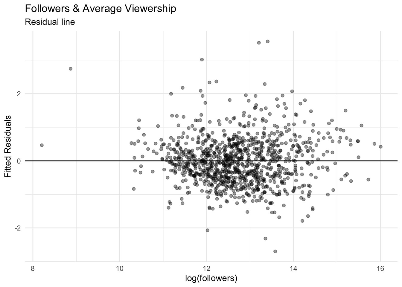
The plot of residuals indicates that our model fits the data well. A residual closer to zero means that our model is estimating each observation well. There are a few large residuals, but they do not seem to be clumped around a particular follower range. Unsurprisingly, the larger residuals fall in follower ranges with less data.
Question 4:
Raw Data and Variables:
twitch |>
  group_by(language) |>
  skimr::skim() |>
head()| Name | group_by(twitch, language… |
| Number of rows | 1000 |
| Number of columns | 13 |
| _______________________ | |
| Column type frequency: | |
| character | 1 |
| ________________________ | |
| Group variables | language |
Variable type: character
| skim_variable | language | n_missing | complete_rate | min | max | empty | n_unique | whitespace |
|---|---|---|---|---|---|---|---|---|
| channel | Arabic | 0 | 1 | 9 | 11 | 0 | 5 | 0 |
| channel | Chinese | 0 | 1 | 4 | 24 | 0 | 30 | 0 |
| channel | Czech | 0 | 1 | 6 | 10 | 0 | 6 | 0 |
| channel | English | 0 | 1 | 3 | 25 | 0 | 485 | 0 |
| channel | Finnish | 0 | 1 | 16 | 16 | 0 | 1 | 0 |
| channel | French | 0 | 1 | 4 | 17 | 0 | 66 | 0 |
Plotting:
twitch |>
  group_by(language) |>
  summarize(avg_viewers = mean(average_viewers),
            channels = n()) |>
  ggplot(aes(avg_viewers, reorder(language, avg_viewers), fill=channels)) +
  geom_bar(stat='identity') +
  pilot::theme_pilot() +
  theme(legend.position = 'none',
        plot.title.position = 'plot') +
  scale_x_continuous(labels=scales::label_comma()) +
  scale_fill_gradient(low = '#2A2B50', high = '#AFB0D5') +
  labs(x='Average Viewers',
       y='',
       title = 'Average Twitch Viewers by Language',
       subtitle = 'Bars filled by number of unique channels')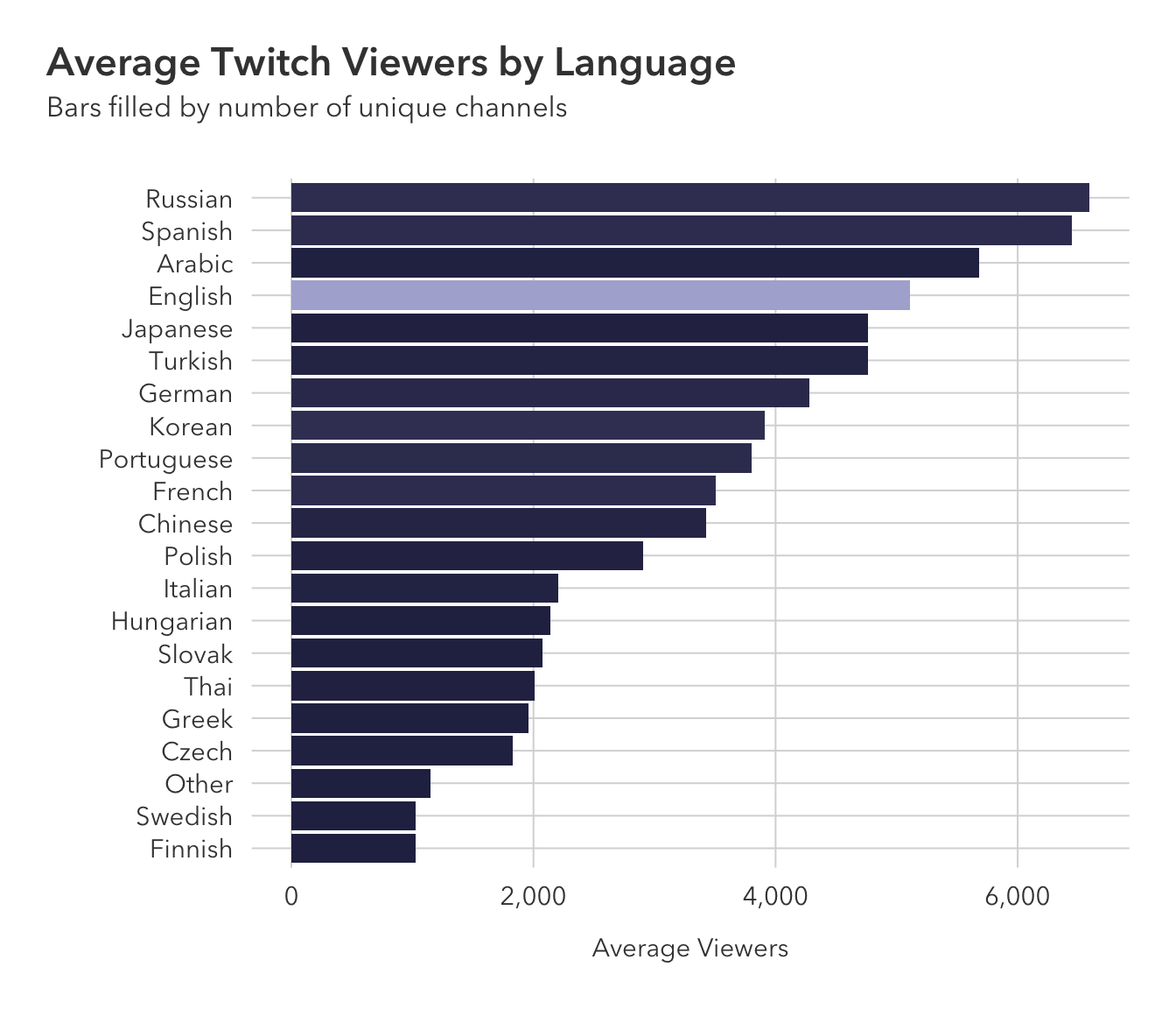
Question 5:
twitch_data <- twitch |>
  mutate(language = as.factor(language),
         language = relevel(language, ref = "English"))
lang_viewers <- lm(data=twitch_data, log_viewers ~ language)
tidy(lang_viewers)# A tibble: 21 × 5
term estimate std.error statistic p.value
<chr> <dbl> <dbl> <dbl> <dbl>
1 (Intercept) 7.98 0.0414 193. 0
2 languageArabic 0.609 0.410 1.49 0.137
3 languageChinese -0.183 0.171 -1.07 0.285
4 languageCzech -0.656 0.374 -1.75 0.0801
5 languageFinnish -1.04 0.912 -1.14 0.254
6 languageFrench -0.136 0.120 -1.14 0.255
7 languageGerman -0.130 0.137 -0.953 0.341
8 languageGreek -0.395 0.912 -0.433 0.665
9 languageHungarian -0.341 0.646 -0.529 0.597
10 languageItalian -0.475 0.225 -2.11 0.0350
# … with 11 more rowsNow, our estimates are related to the average against English streamers. There are only 3 languages that have a higher average number of viewers compared to English: Arabic, Russian, and Spanish.
Question 6:
augment(lang_viewers)# A tibble: 1,000 × 8
log_viewers language .fitted .resid .hat .sigma .cooksd .std.resid
<dbl> <fct> <dbl> <dbl> <dbl> <dbl> <dbl> <dbl>
1 10.2 English 7.98 2.25 0.00206 0.909 0.000603 2.48
2 10.2 English 7.98 2.17 0.00206 0.909 0.000562 2.39
3 9.30 Portuguese 7.73 1.57 0.0164 0.910 0.00240 1.74
4 8.95 English 7.98 0.974 0.00206 0.911 0.000113 1.07
5 10.3 English 7.98 2.32 0.00206 0.908 0.000639 2.55
6 10.7 English 7.98 2.68 0.00206 0.907 0.000853 2.94
7 10.1 English 7.98 2.12 0.00206 0.909 0.000532 2.33
8 9.85 English 7.98 1.88 0.00206 0.909 0.000418 2.06
9 10.0 English 7.98 2.04 0.00206 0.909 0.000494 2.24
10 9.42 English 7.98 1.45 0.00206 0.910 0.000249 1.59
# … with 990 more rowspred_data <- augment(lang_viewers)pred_data |>
left_join(
twitch_data |> group_by(language) |> summarize(avg_viewers = mean(average_viewers))
) |>
ggplot(aes(x = reorder(language, avg_viewers),
y = .resid)) +
geom_jitter(alpha = 0.2) +
geom_line(aes(x = language,
y = .resid),
col = "purple") +
coord_flip() +
pilot::theme_pilot() +
theme(plot.title.position = 'plot') +
labs(y = 'Model Residual',
x = '',
title = 'Model Residual for Twitch Viewers and Stream Language')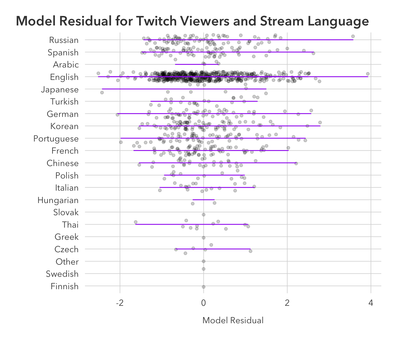
pred_data |>
  ggplot(aes(x = .resid, y = language)) +
  ggdist::stat_gradientinterval(
    width = .3, color = "black", fill = 'purple'
  ) +
  pilot::theme_pilot() +
  theme(plot.title.position = 'plot') +
  labs(x = 'Model Residual',
       x = 'Stream Language',
       title = 'Density of Model Residuals',
       subtitle = 'Analyzing average Twitch viewers and stream language')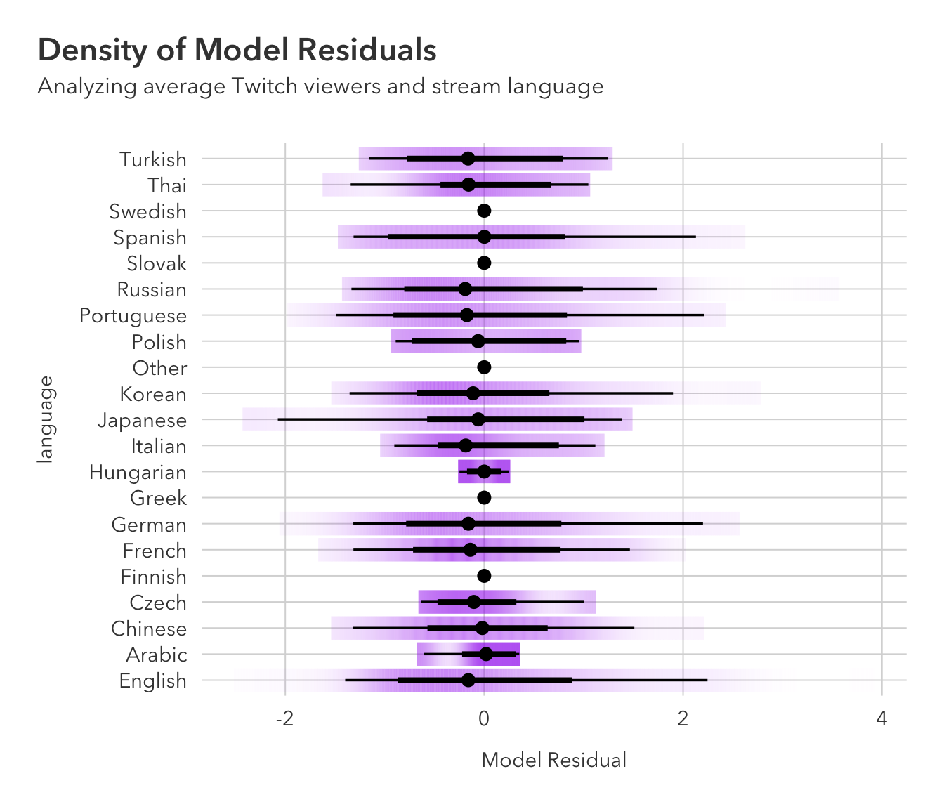
The two points that our model badly missed on:
pred_data |>
  slice_max(order_by = .resid, n =2) |>
  select(language, .resid)
# A tibble: 2 × 2
language .resid
<fct> <dbl>
1 English 3.93
2 Russian 3.57