library(tidyverse)
library(causact)
library(patchwork)
library(pilot)
library(MetBrewer)Week 5: SOC 223
Preparation
Load the needed libraries:
Load the data:
exercise_data <- read_csv('https://github.com/NicolasRestrep/223_course/raw/main/Data/visualize_data.csv')Question 1:
cor(exercise_data$Exercise, exercise_data$BMI)[1] -0.06447185The output indicates that there is a very slight negative coorelation between the two variables.
exercise_data |>
  ggplot(aes(Exercise, BMI)) +
  geom_point()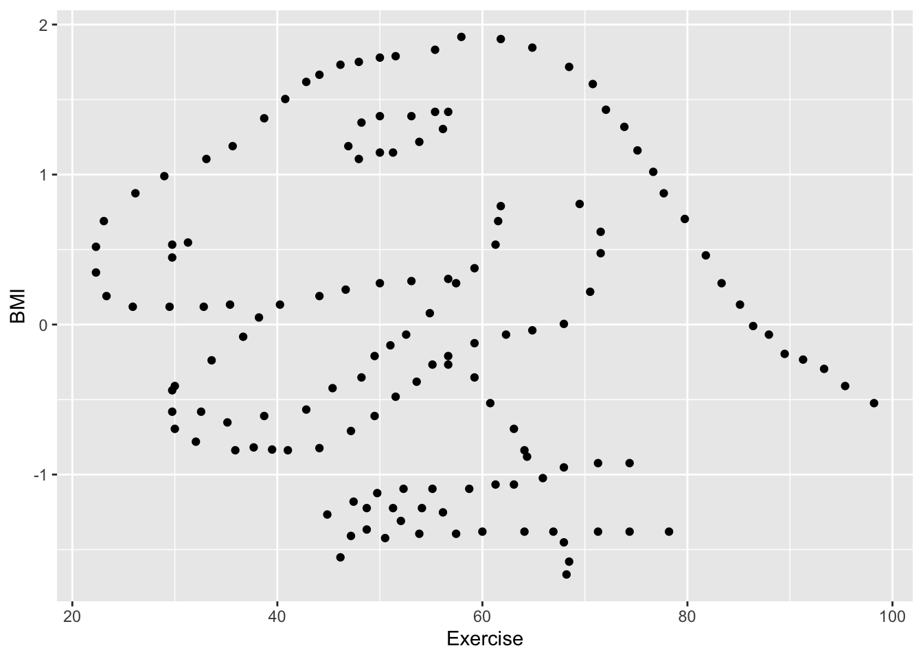
I see a dinosaur.
Question 2:
glimpse(corruptDF)Rows: 174
Columns: 7
$ country <chr> "Afghanistan", "Albania", "Algeria", "Angola", "Argentina"…
$ region <chr> "Asia Pacific", "East EU Cemt Asia", "MENA", "SSA", "Ameri…
$ countryCode <chr> "AFG", "ALB", "DZA", "AGO", "ARG", "ARM", "AUS", "AUT", "A…
$ regionCode <chr> "AP", "ECA", "MENA", "SSA", "AME", "ECA", "AP", "WE/EU", "…
$ population <int> 35530081, 2873457, 41318142, 29784193, 44271041, 2930450, …
$ CPI2017 <int> 15, 38, 33, 19, 39, 35, 77, 75, 31, 65, 36, 28, 68, 44, 75…
$ HDI2017 <dbl> 0.498, 0.785, 0.754, 0.581, 0.825, 0.755, 0.939, 0.908, 0.…CDI is an annual index of perceived corruption levels in 180 countries as assessed by local business people and experts.
HDI is an annual composite ranking of several key human development metrics.
Question 3:
I see a positive relationship between CPI and HDI. The trend appears to follow a standard logarithmic growth curve, with a looser fit as you approach smaller HDI and CPI values.
corruptDF |>
  ggplot(aes(CPI2017, HDI2017)) +
  geom_point()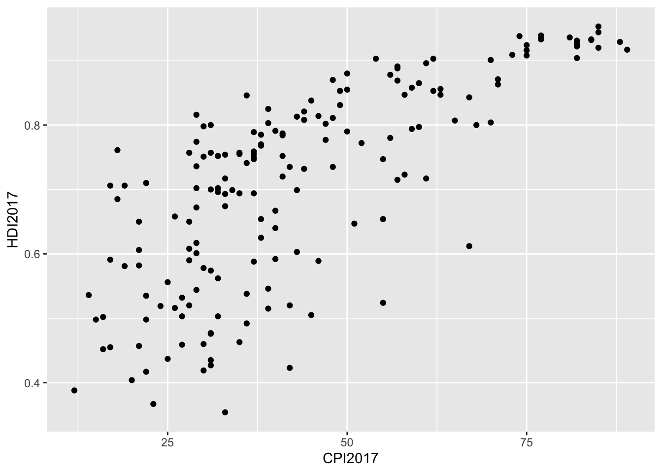
Question 4:
As expected, lm fits a standard linear regression line, while gam utilizes a generalized additive model that allows for fitting a non-linear predictor to the data set.
I prefer the generalized additive model because, on quick glance, it appears to fit the data better.
p1 <- corruptDF |>
  ggplot(aes(CPI2017, HDI2017)) +
  geom_point() +
  geom_smooth(method='lm', color = 'navy') +
  theme_pilot(title_size = 9.5) +
  labs(title = 'Using linear regression')

p2 <- corruptDF |>
  ggplot(aes(CPI2017, HDI2017)) +
  geom_point() +
  geom_smooth(method='gam', color='navy') +
  theme_pilot(title_size = 9.5) +
  labs(title = 'Using generalized additive model',
       y='')

p1 + p2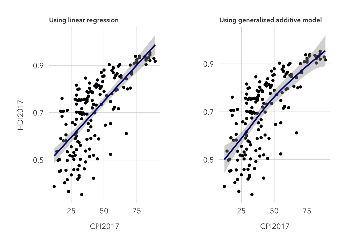
Question 5:
This is an improvement on the previous graph because it distinguishes individual regions and draws a predictor curve for each, but it could be improved by faceting the data. Without a facet, trends are difficult to spot, but it does seem likely that western European countries feature both a high HDI and CPI, while Sub-Saharan African countries typically see low values in each.
corruptDF |>
  ggplot(aes(CPI2017, HDI2017)) +
  geom_point(aes(color=region)) +
  geom_smooth(method = 'gam', aes(fill=region, color=region)) +
  scale_color_manual(values = met.brewer('Lakota')) +
  scale_fill_manual(values = met.brewer('Lakota')) +
  theme_pilot()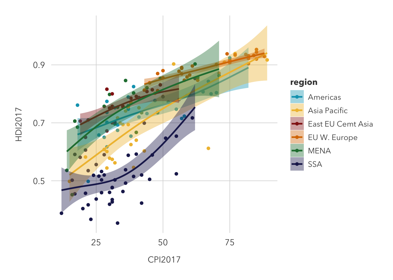
Question 6:
The quickest way to reverse axis scales is to use scale_x/y_reverse.
corruptDF |>
  ggplot(aes(CPI2017, HDI2017)) +
  geom_point(aes(color=region)) +
  geom_smooth(method = 'gam', aes(fill=region, color=region)) +
  scale_color_manual(values = met.brewer('Lakota')) +
  scale_fill_manual(values = met.brewer('Lakota')) +
  scale_x_reverse() +
  theme_pilot()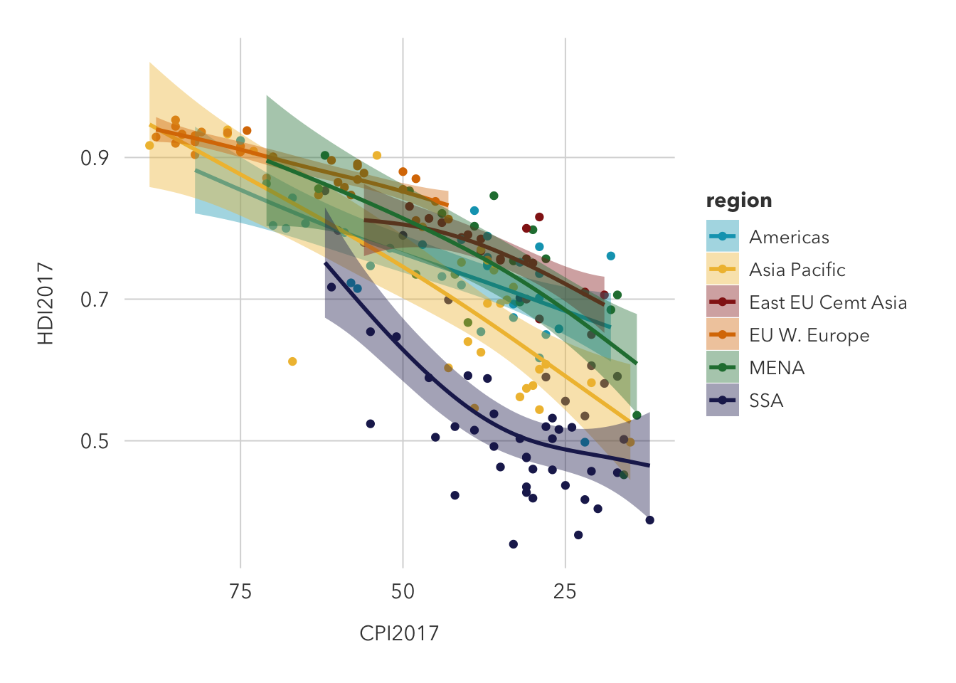
Question 7:
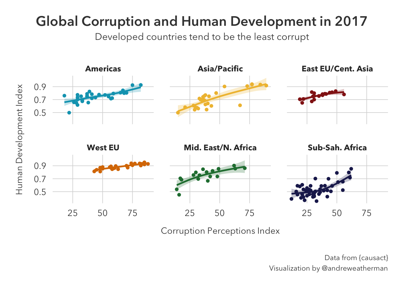
I’m not a huge fan of reversing the x-axis here because I think most people would be conditioned to see the first quadrant as positive. As such, I am not going to adjust the x-axis. Adding proper labels and faceting by region yields:
names <- c('Americas' = 'Americas', 'Asia Pacific' = 'Asia/Pacific', 'East EU Cemt Asia' = 'East EU/Cent. Asia',
           'EU W. Europe' = 'West EU', 'MENA' = 'Mid. East/N. Africa', 'SSA' = 'Sub-Sah. Africa')

corruptDF |>
  ggplot(aes(CPI2017, HDI2017)) +
  geom_point(aes(color=region)) +
  geom_smooth(method = 'gam', alpha=0.25, aes(fill=region, color=region)) +
  scale_color_manual(values = met.brewer('Lakota')) +
  scale_fill_manual(values = met.brewer('Lakota')) +
  facet_wrap(~region, labeller = as_labeller(names)) +
  theme_pilot() +
  theme(
    legend.position='none',
    plot.title = element_text(hjust = 0.5),
    plot.subtitle = element_text(hjust=0.5),
    plot.caption = element_text(lineheight = 1.2),
    plot.title.position = 'plot'
  ) +
  labs(
    title = 'Global Corruption and Human Development in 2017',
    subtitle = 'Developed countries tend to be the least corrupt',
    caption = 'Data from {causact}\nVisualization by @andreweatherman',
    x = 'Corruption Perceptions Index',
    y = 'Human Development Index'
  )
Question 8:
Saving as a .PDF would be the best idea for exporting for poster or journal use:
ggsave(plot=last_plot(), 'countries.pdf')In most situations, however, I would just save it as a .PNG if I were to show a supervisor, post on Twitter, etc. PDF files, while nice because they maintain vector formats, can be a real pain if you are using a custom font or rendering anything using HTML (looking at you gt, reactable, etc.). Like for example, stock saving using the above code fails to render any text at all.
ggsave(plot=last_plot(), 'countries.png')